A strong brand for a better future - DUOLIFE's new visual identity!
Dear Club Members,
Nearly a decade of DUOLIFE's history has been marked by continuous development, great achievements and wonderful celebrations, in line with our idea of man at the centre of attention and our core values: Trust, Integrity and Respect. Together we have built the DUOLIFE brand, and now.... we want to go even further! To make it possible, we have decided to change our visual identity, which will allow us to spread our wings.

Recent years have seen DUOLIFE's steady business growth, which has translated into increased geographic scope of our operations and expansion into new markets. What is essential to further strengthen the company's position is an appropriate visual identity that underlines DUOLIFE's size, nature and dynamism. At the same time, we want our logo and other features to be clear, user-friendly. distinctive and recognisable in every country.
The change of logo applies to each case when our visual identity is used. Consequently, DUOLIFE products, including packaging, company materials and other branding elements, will be successively replaced and updated.
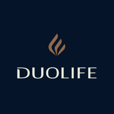
The new DUOLIFE logo consists of two elements: a wordmark and a badge, which symbolises the three pillars of DUOLIFE: Health, Development and Business, as well as our philosophy.
The philosophy behind the logo

Fire
Symbolises eternity, warmth and security. It draws on the symbolism of the current brand badge and is easy to remember.

Wing
Symbolises unlimited freedom and liberty, as well as imagination, crossing boundaries and making dreams come true.

3 pillars
3 sections that make up the badge symbolise the inseparable elements of our brand philosophy - Business, Health and Development.

Balance
Symbolises balance between different aspects of life: taking care of oneself, taking care of one's health, finding time for family and personal development, as well as fostering relationships.

Dynamics
Force, energy and speed with which things happen and new possibilities emerge.

Leaf / drop
Symbolises naturalness and high quality ingredients that we use in our products.
After a decade in business, DUOLIFE has become a global brand. The new visual identity will allow us to share our mission, values and the entire DNA of our brand in more countries.
For the past 10 years, we have been working hand in hand, creating a new reality, pursuing our dreams and celebrating achievements under the DUOLIFE flag. A strong brand for a better future of us all.
Make every day unique…
